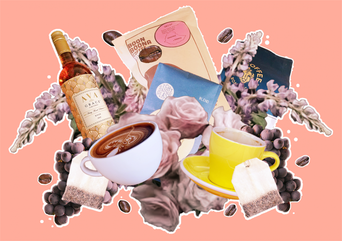

As a fan of maximalism and coffee packaging, this article is a match made in heaven. I’ve been collecting coffee packages for the past few years and I’m thrilled to say visual personality is at an all time high.
If you’re looking for a dose of artistic inspiration, check out this compelling article from the (newly revived!) Fresh Cup Magazine. The author takes a look at several specialty roasters and how they’re using packaging/branding to stand out on a visual level. There are some truly gorgeous examples of coffee packaging here, particularly Couplet and Felix Roasting Co.. My retro-and-classical loving heart is a-flutter.
This approach is style meeting substance. Not only is powerful visual design a must-have for any brand that wants to stand out, minimalism has garnered a rather meager reputation over the years. Too much of specialty coffee is modeled after the wine industry in terms of exclusivity and an ‘in the know’ attitude. Many of the roasters in this article hope that a fun, splashy approach will encourage people to get into a new passion.
Do you have any favorite coffee packaging designs? I’m always on the look for more bags and boxes to add to my collection, so let me know in the comments.
